


5) AFC Bournemouth – Away
While this technically isn’t a new kit, Bournemouth blends black and blue into a beautiful looking kit.
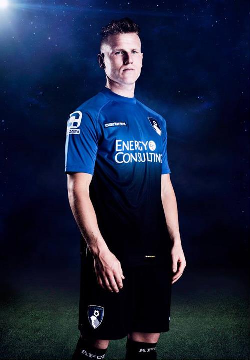
Image courtesy of footyheadlines.com
There is sometimes a risk when teams blend in colors like this to create a kit. It’s a definite risk and sometimes it can be a disaster. The newly promoted Championship winners recycled this away kit from last year and it was a good decision. It helps to blend in dark blue and black, Bournemouth took the least amount of risk doing that and it surely paid off.
As a bonus, Bournemouth launched an all pink third kit designed to raise awareness for breast cancer. Bournemouth will donate a portion of the sales from these kits to breast cancer charities. While they aren’t in the top 10, I thought it would be nice to mention that.
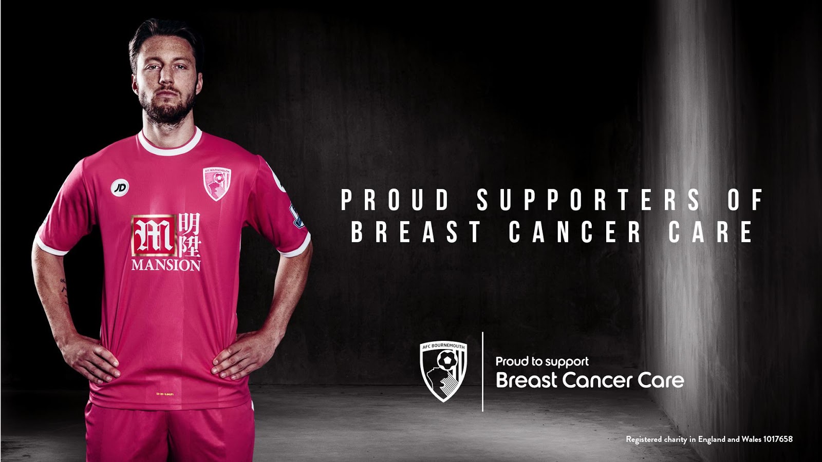
Image courtesy of footyheadlines.com
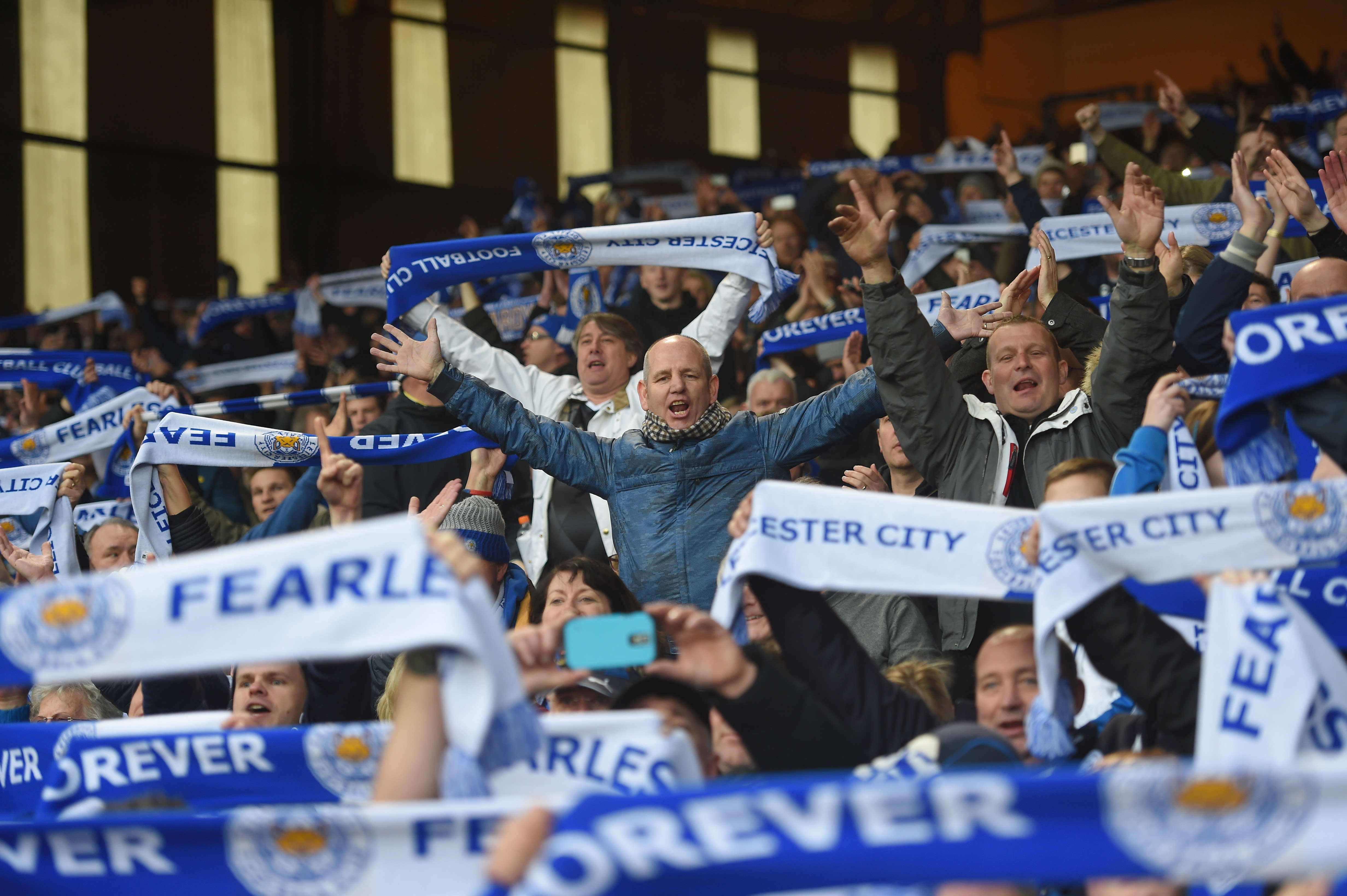
4) Leicester City – Away
Leicester went all black with the nice touch with the seemingly matte black finish and diamond pattern to add that nice detail to round out the kit.
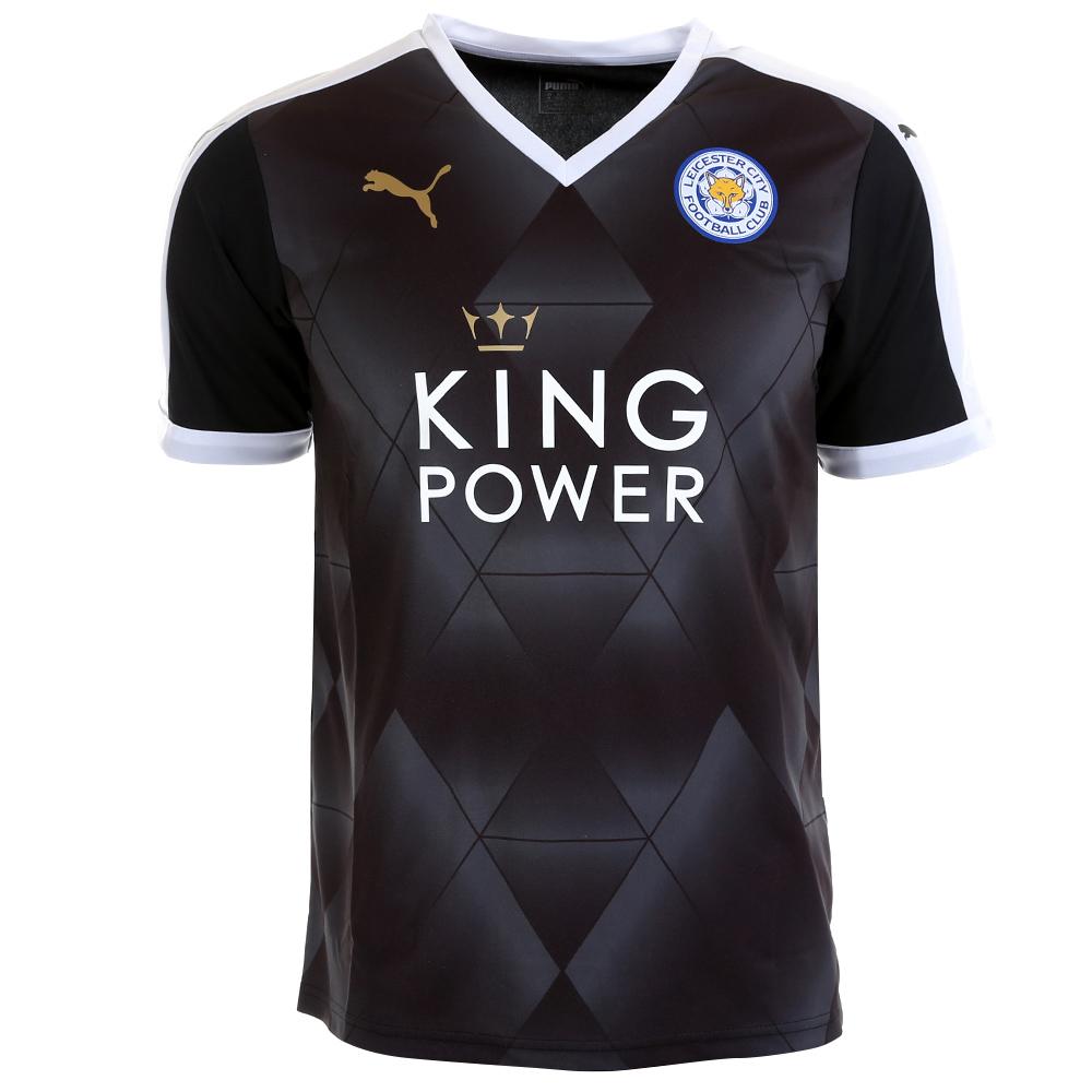
Similar with Arsenal and the other Puma teams, Leicester City has diamonds on their kits. This one looks great because it’s all black but at the same time has a considerable amount of detail with the matte black finish.
3) Everton – Away
Definitely the cleanest looking kit. Everton goes gray on white this season.
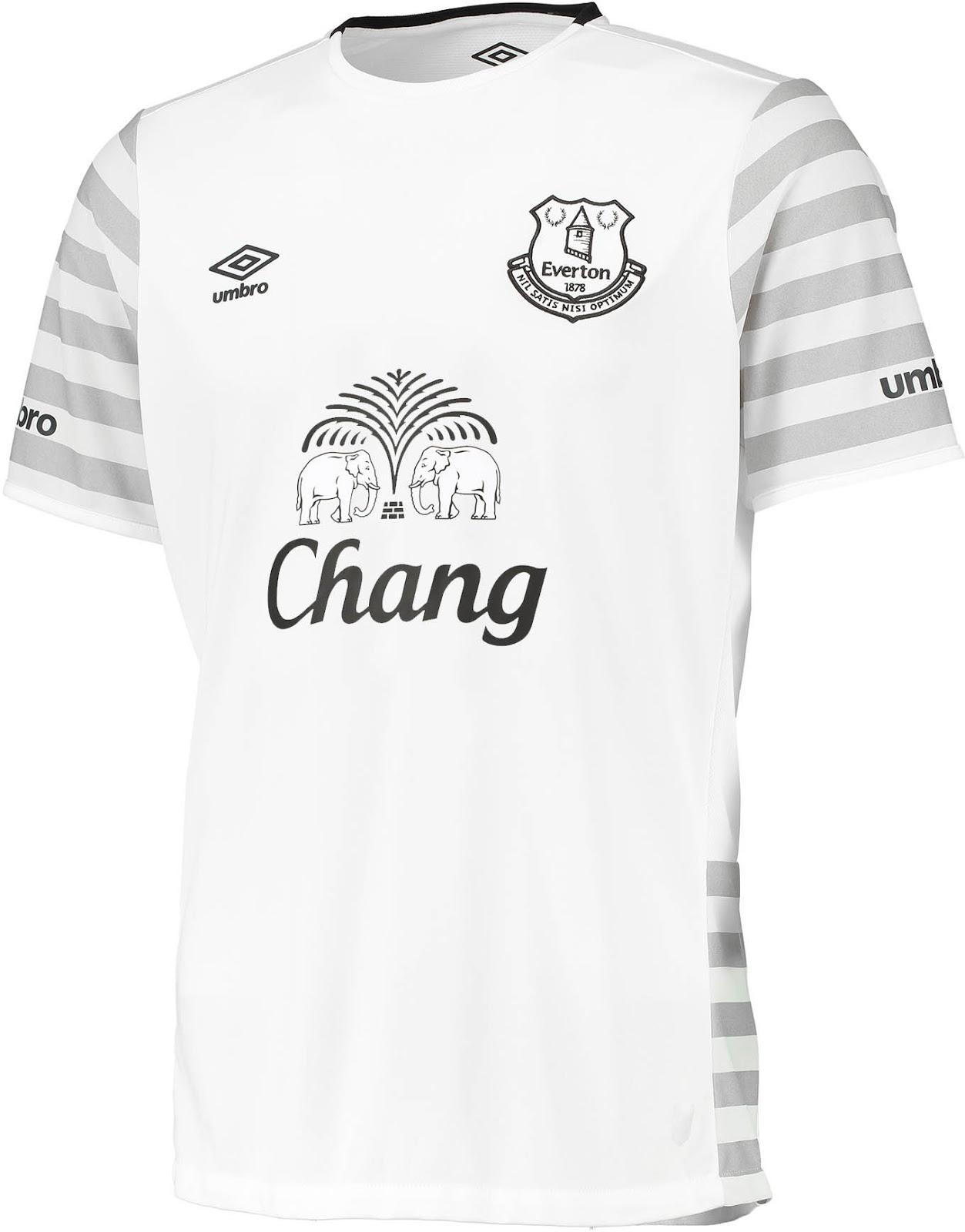
Image courtesy of footyheadlines.com
Going from all black to all white, Everton has an all white with gray stripes kit. What makes this kit work is that “Chang” logo on the kit. If it had been any color other than gray, it would’ve immediately been one of the worst kits ever. Incorporating the kit sponsor into the kit, makes this one of the best looking kits out there.
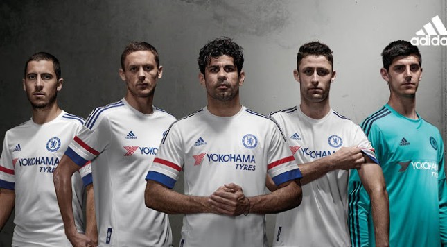
2) Chelsea – Away
The club that traditionally goes white and blue, Chelsea adds a little bit of red to the away kit to complete the look.
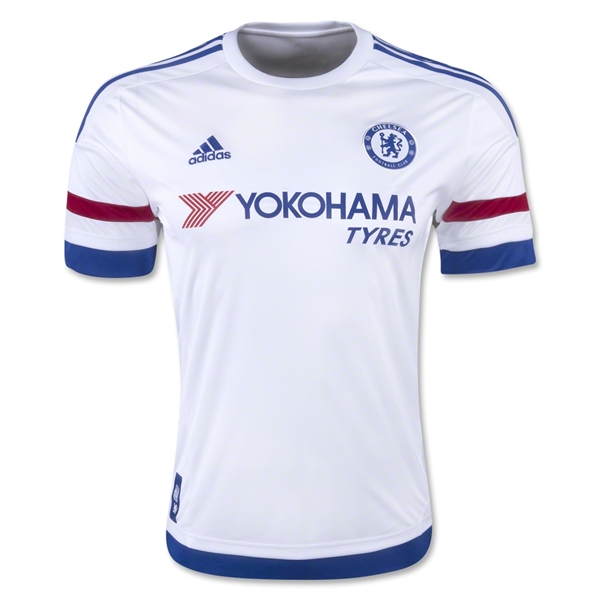
The EPL Champions may be champs on the field but they fall just short in the kit rankings. When I first saw this kit, I immediately thought that this could’ve been the kit for the Dutch National Team if they didn’t have the traditional orange and designed a kit after their flag. The “Yokohama Tires” logo incorporates both blue and red and it’s a very clean looking kit.
1) Crystal Palace – Away
There must be something with a primarily white kit with blue and red stripes because I put similar looking kits in the top two. Crystal Palace’s kit takes the top spot.
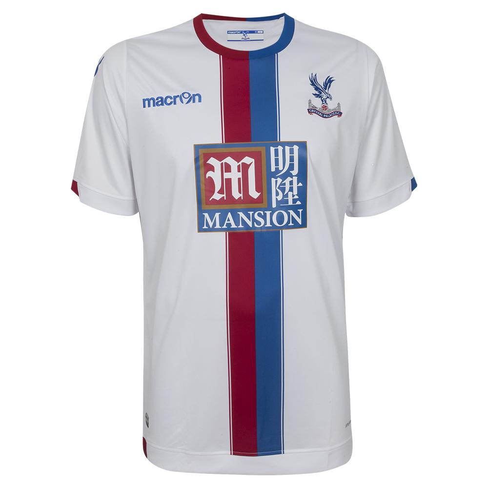
Crystal Palace’s kit, and their stripes going down the middle of the kit reminds me of looking at a race car. When a race car has a multi colored stripe going up the middle of the car, it’s a classic look for a great car. Crystal Palace does this as well and put out a kit that may look like it conforms to the norm but they make it a little bit different by putting the stripes down the middle. For that, Crystal Palace takes the top spot.