


The English Premier League season starts on August 8 and we at 32 Flags cannot wait for the start of the EPL and the rest of the European league season. One of the great things about the new season is the new kit designs from all the teams. Some kits are works of art while some aren’t so much. We already covered the best kits a little earlier this week. Now, we’re here to talk the worst kits of the season.
I have to be honest, looking at every kit in this upcoming Premier League season, this was a very great year for kit designs. Even some of the kits on this list don’t look that bad and in any other season, they wouldn’t be on this list. Nevertheless, ten of them need to be chosen so here we go.
10) Aston Villa – Away
Aston Villa goes bright with this yellow and black look.

The kit itself is clean and actually looks very good. It’s a little on the bright side which may turn some people off but this kit will definitely win some praise from TV and radio broadcasters because they’ll easily be seen.
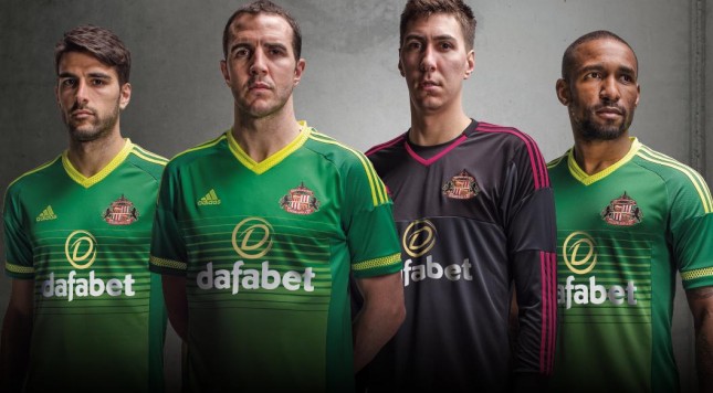
9) Sunderland – Away
Sunderland’s new away kit is green on green for the team in red.
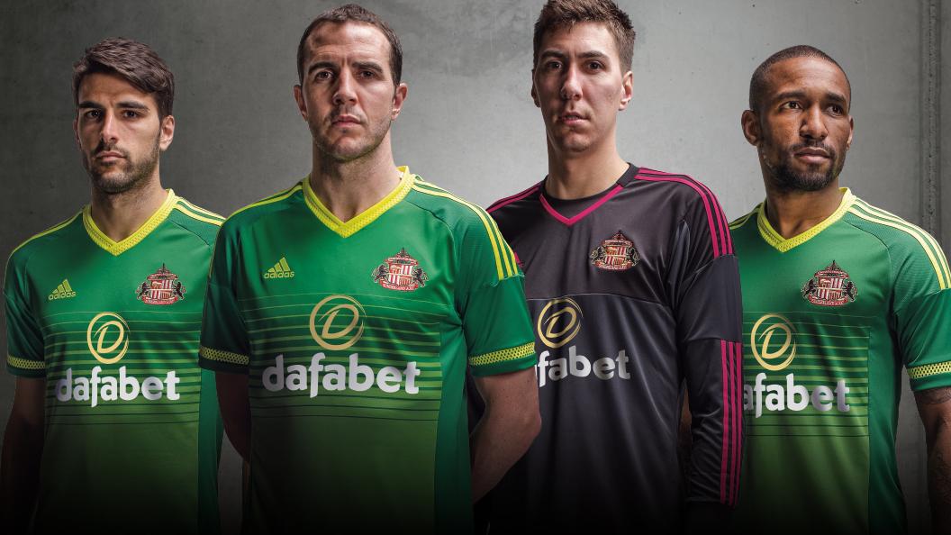
Image courtesy of footyheadlines.com
This is just a personal statement from me, if a team incorporates light and/or fluorescent green, that is going on a list like this at some point. I don’t know how fluorescent green seeped into the fashion consciousness but it just gives me literal headaches if I look at that long enough. Lucky for Sunderland, there’s another kit that is an even bigger eyesore.
8) Manchester United – Third
Manchester United is going Halloween with this black and orange kit.
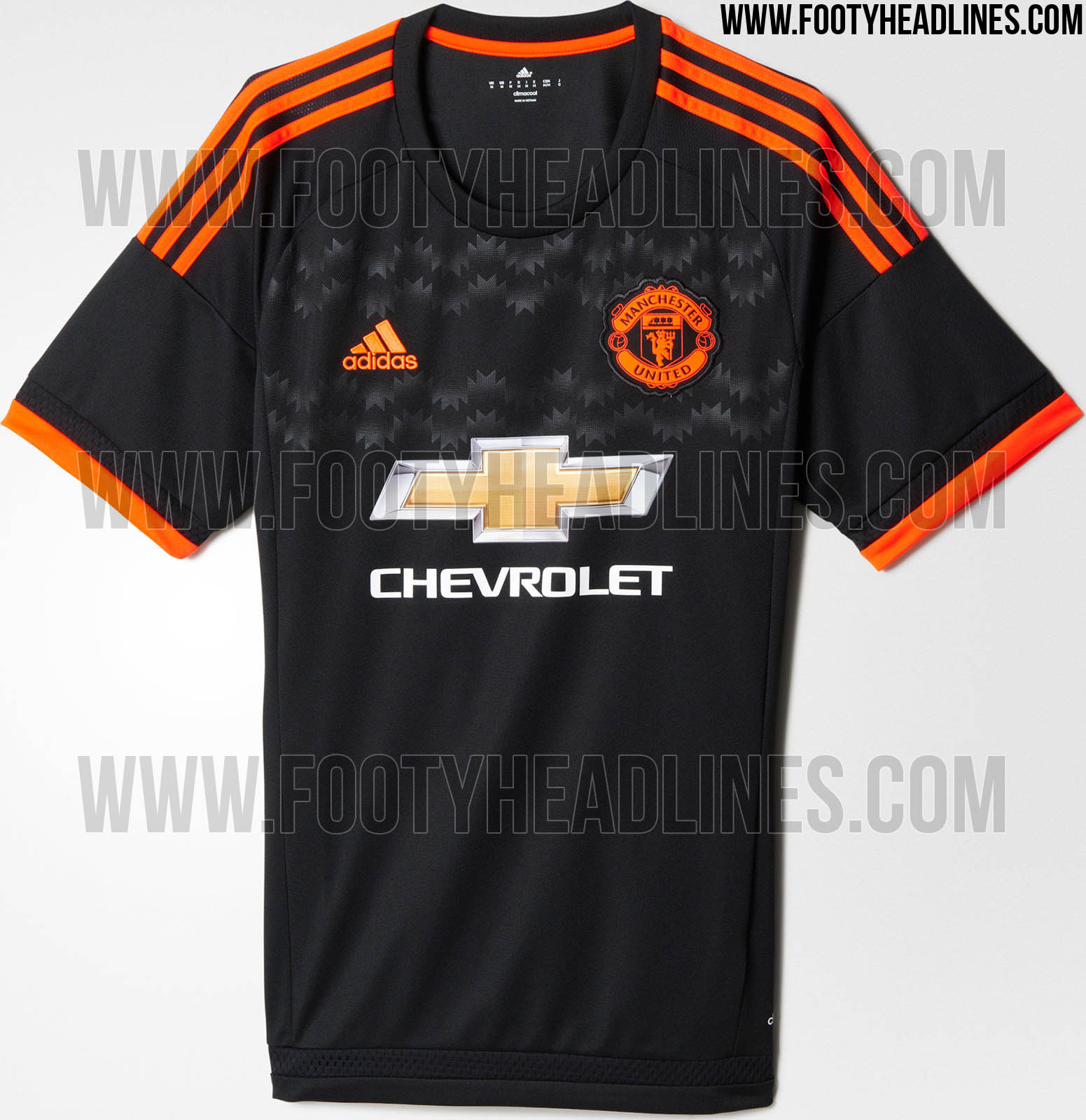
Image courtesy of footyheadlines.com
Manchester United hasn’t “officially” revealed their third kit yet so the only info we can go off of is what Footy Headlines has provided. They’re very reliable when it comes to kit news so barring some small details, this will likely be the design. It’s not that bad but there is one big detail that I absolutely do not like on Man United’s kits which I’ll go into greater detail later in the article.
7) Tottenham Hotspur – Away
Tottenham went with black horizontal stripes for their away kit.
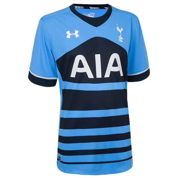
Spurs’ light blue with black stripe design is a generally good looking kit. I have no problem with the color scheme. The black stripes are way too thin and make the kit look like some sort of weird optical illusion. Like the bottom of the kit is ripped or something.
6) Watford – Home
Tottenham may have went with horizontal stripes but Watford took thing to another level with this bee inspired kit.
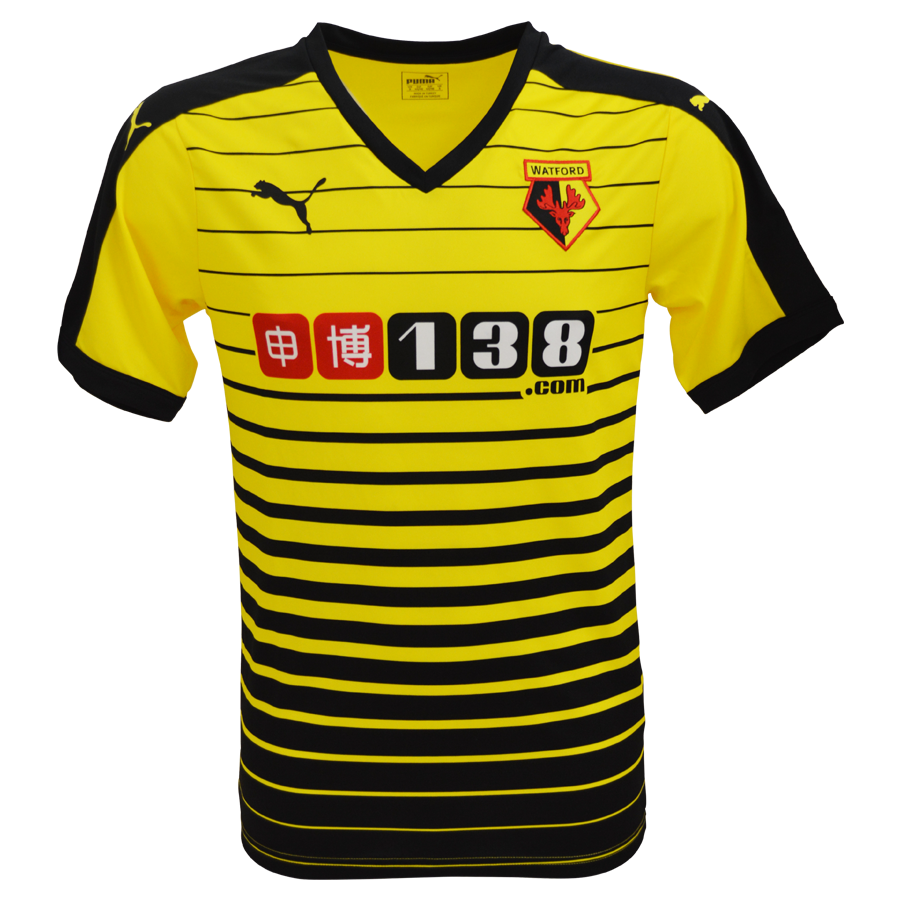
Similar with Tottenham, the horizontal stripes (in this case, get larger as you go lower) look like the kit is ripped. That, added with the bright yellow, like Aston Villa’s kit, make this a rather jarring kit to look at.
CONTINUE TO SEE THE TOP 5