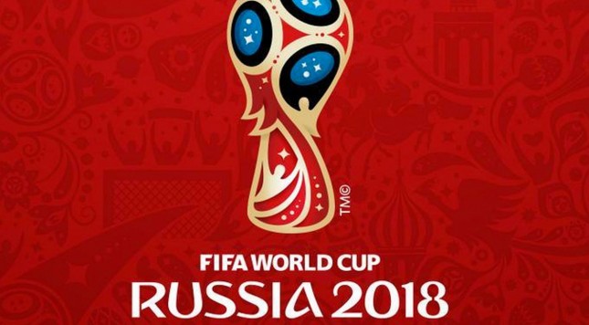
Yesterday, Russia revealed the official logo for the 2018 FIFA World Cup. Except for the colors, they pretty much went along the trophy route just like the 2014 World Cup. Like with any logo, there’s a lot of unknown symbolism which you can see below.
For those asking, basically 18 WC logo is about magic, space and "fairy-tale glitter." Of course. FIFA's explanation: pic.twitter.com/xkH6QUQkK2
— Brian Straus (@BrianStraus) October 28, 2014
My first thought was that it kind of looked like someone was awkwardly trying to roll a bowling ball overhand. I will say, even though they went with the same concept, it’s way better than the 2014 logo which clearly shows someone face palming.


