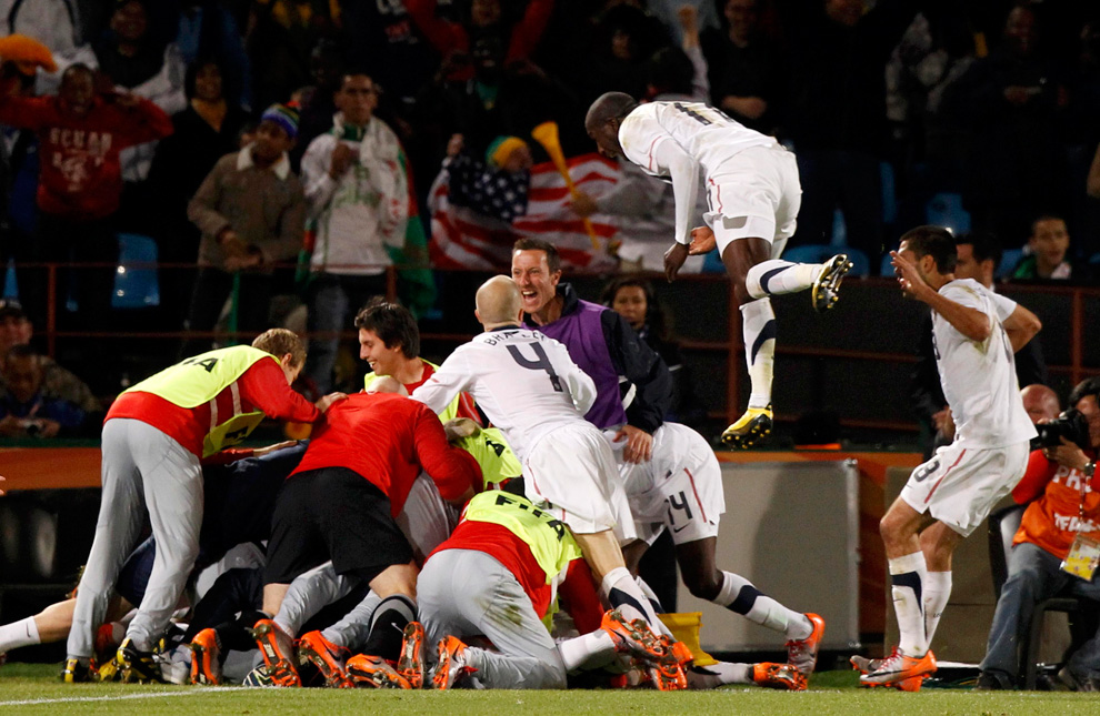


Soccer jerseys are a funny thing for the American sports fan to comprehend. Every year there are little tweaks, changes, and alterations with the intent of having fans go out and buy the newest kit. While there is much tradition in the home kits of everyone from Liverpool to Leicester, the away jerseys and alternate third strips often change wildly every year.
That constant change means there are a lot of jerseys to choose from if you want to try to make a fashion statement as a trendy EPL fan. But beware, because those statements can either be tres chic or worthy of being covered with a burlap sack.
With that in mind, we’re here to break down the best and worst EPL jerseys for the coming season. Let’s start with the bad news first and the Bottom 10 EPL Jerseys. These are true relegation contenders…
10) Tottenham Hotspur Away Jersey

If there’s one thing that can derail a decent jersey, it’s a massively huge sponsorship. Tottenham’s home and away jersey are both dominated by their AIA logo, but the away kit makes our countdown thanks to the racing stripe down the middle of it.
9) Sunderland Home Jersey
.jpg)
Good luck explaining to any novice Premier League fan why Sunderland, Stoke City, and Southampton all wear the same jersey. (Or West Ham, Aston Villa, and Burnley for that matter.) In that respect, we give Sunderland credit for the black armpit section that makes this jersey a little different. But on second thought, we’re wondering why they are so intent on trying to hide their players’ pit stains.
8) Burnley Away Jersey
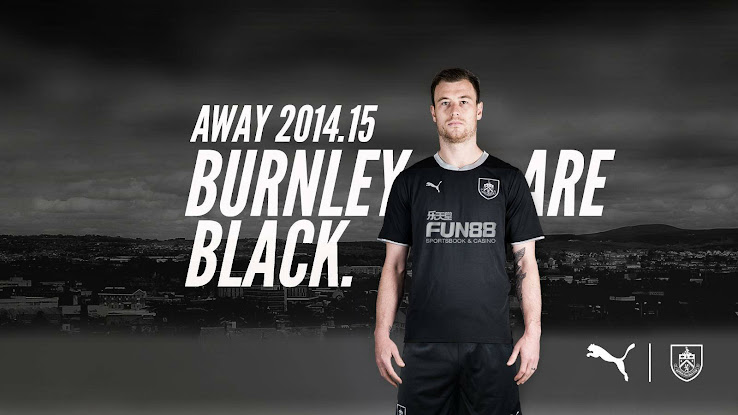.jpg)
It’s tough to screw up an all-black jersey (just ask the New Zealand rugby team) but Burnley’s away jersey from Puma is one of the more bland and uninspired looks you’ll see in the Premier League this season. It’s the opposite of fun.
7) Chelsea Third Jersey

Am I watching a soccer match or is this supposed to be some kind of sound wave experiment?
6) West Bromwich Albion Home Jersey

Pinstripes are all the rage in the EPL this season and for good reason, they add a touch of class. But when those pinstripes are contrasted with everything else happening on WBA’s jersey, it creates an amalgamation of stripey things that don’t really fit together.
5) Manchester United Home Jersey

Sponsorships are a major part of a soccer jersey. If you’re wearing a kit out in public, you don’t want an overwhelmingly garish sponsorship logo to turn you into a walking billboard. Oh, hi there, Chevy. How many Chevrolets are there in Manchester anyways?
4) Swansea Away Jersey

Speaking of garish sponsorships, just what is that donning the Swans’ kit? Apparently a company called Goldenway Global Investments is behind the “24k.hk GWFX” secret message that just screams South Wales. Also, Blackburn Rovers called and want their away jersey back.
3) Newcastle United Home Jersey

It’s like they forgot that the stripes are supposed to go all the way to the top. In case you’re wondering what Wonga is, it’s a British loan company, but it can also serve as a sportscaster’s terrible catchphrase. WONGA!!
2) Newcastle United Goalkeepers Jersey
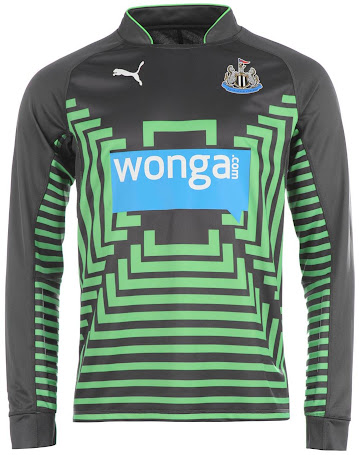
Congrats to the Magpies for being the only club to make our countdown twice. I have no idea what you call this pattern, but I’m just going to go with “portal to an alternate dimension” or “Mike Ashley’s personal design.”
1) Liverpool Third Jersey

Ever since taking over the Liverpool jersey from Adidas, Warrior Sports has produced some widely panned efforts that can best be described as polarizing. This third jersey is no different. Liverpool have had some very sharp looking black alternate jerseys in the past, but the colored bars/sash combo is equal parts audacious and atrocious.