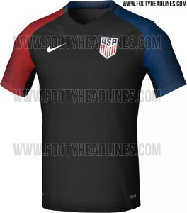
Nike and U.S. Soccer, please tell me the pics we saw today of a leaked USMNT kit is some sort of cruel, unfunny, tasteless joke? I’ll even take that this design was a first draft and it’s different. Just anything other than this monstrosity of a kit that really offends all senses, even smell. In case you haven’t seen it yet, Footy Headlines has the pic and… well just see for yourself.
Since it seems like Nike is more concerned about their #brand than designing a kit for the United States of America, here’s a tip. The United States colors on the flag are red, white and blue. Not black or green or any other color you decide to put on a national team kit instead of the traditional colors, especially colors of a rather patriotic nation like the USA.
And another thing. A primarily black kit in the middle of freaking June??? I don’t care what that kit is made of, all the “dri-fit” technology in the world doesn’t mask the fact that players and fans will be wearing a black kit in the middle of June.
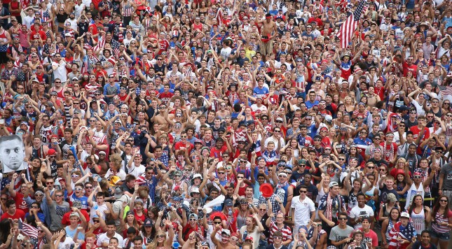
So, not only did this kit fail both in looks and practicality but instead of seeing a sea of red, white and blue in the stands of the American Outlaws, we’re expecting to see black for the biggest tournament hosted by the United States since the 1994 FIFA World Cup. Which, by the way, I would die to have the denim USMNT kits from ’94 here. Even that would be an improvement over this new kit.
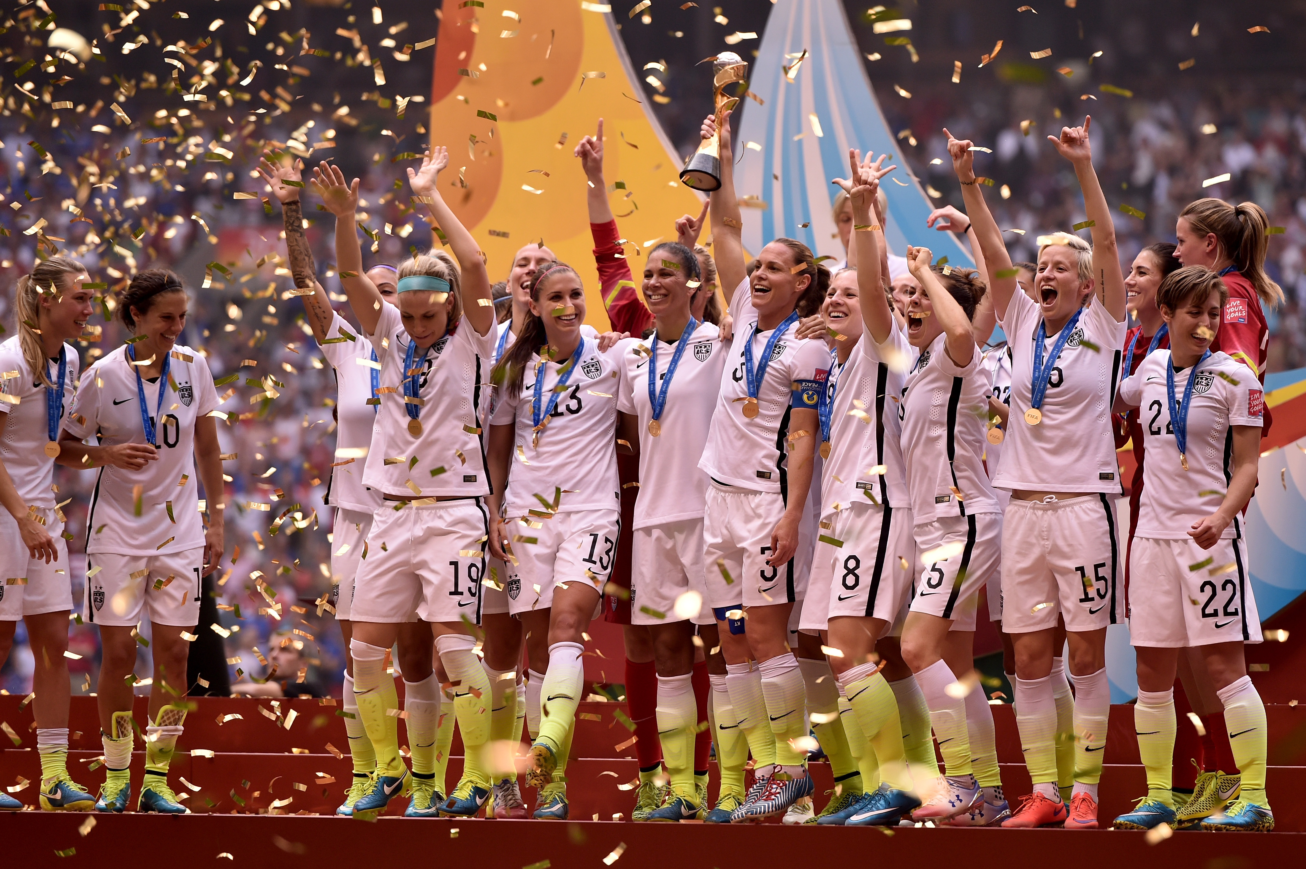
I understand that thinking “outside the box” and incorporating different colors and styles every year helps with marketing and sales but be a little more practical. I thought the white with black and green kits from the Women’s World Cup was bad, but this takes it to a whole new level.
This isn’t some 7th grade art project where any wild and crazy idea get’s you an “A,” this is what the players and fans of the United States of America will be wearing. Take it from a fan and kit collector. Bring back the Centennial Crest U.S. Soccer had that was universally beloved and have some sort of combination of red, white and blue and no other colors. That’s it, it’s not that difficult. Even if most fans don’t like it, at least there will be a sector of fans who will and at least it’ll be patriotic. If you’re expecting people to shell out $150 on these kits, at least put a little more thought into this. Because as of now, I haven’t seen one positive response to this kit and regardless of what anyone within Nike or U.S. Soccer may think, that’s pretty bad for business.
The only reason I considered buying the white USWNT kit from last year was because the team won the Women’s World Cup. But Nike doesn’t sell USWNT kits in a men’s cut (another problem that we’ll tackle another time). Prove me wrong and release something (anything) different than this on the actual launch but if this is really the plan, let’s hope the other kit is a much better attempt.

