The 2016 MLS season gets underway on March 6 and while many fans are eager to see famliar and new faces added this offseason, they’re also looking forward to the new kits from their favorite teams. Many other soccer leagues release all new kits every year, but MLS and Adidas operate on a two-year cycle for kits. It’s set up that every team will either release their primary (home) kit or secondary (away) kit this year, and then vice-versa next year. Due to merchandise sales, only the Seattle Sounders and Sporting Kansas City will have third kits this season with Seattle releasing a new third kit along with their primary.
We’ve ranked each of the new MLS kits that have been released this year. If you want to check out every MLS kit that will be worn this season, head over to Comeback Media’s soccer site 32 Flags, where pics of every MLS kit are available to view and will be continuously updated. 32 Flags will also have something similar for EPL, top UEFA Champions League teams and summer tournaments like Euro 2016 in the coming months.
Before ranking all the kits, Adidas must be commended for changing the location of the three stripes. Traditionally, Adidas’ trademark three stripes went down the top of each shoulder. Now, the stripes go down the sides of the kit and that has made every kit look better just simply because of that.
(NOTE: There will be 21 new kits this season, but only 18 have been officially released as of this publication. Colorado Rapids, FC Dallas and Toronto FC each have a kit they plan to launch but will do that closer to the start of the season.)
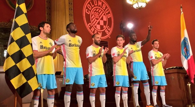
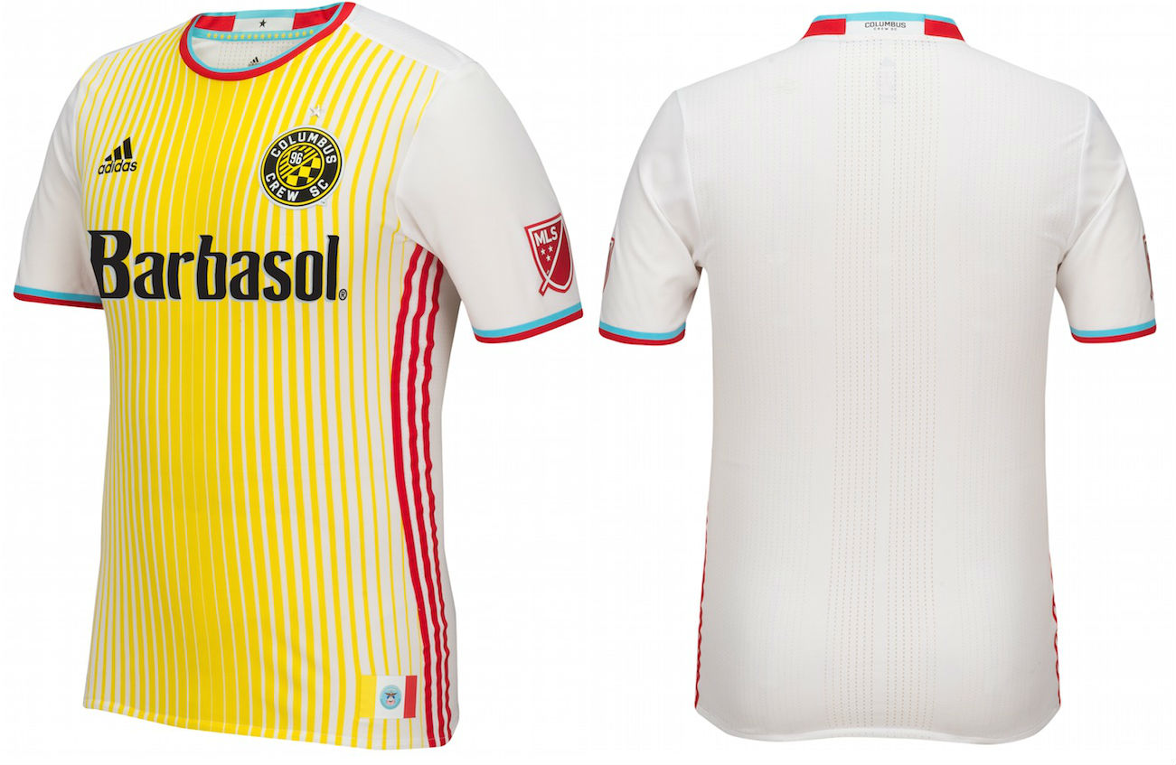
18) Columbus Crew SC – Secondary
The Sharknado of MLS kits, because it looks so bad, it’s great. We ranked this last based on principle because, well look at it, but I would definitely be proud to wear this ironically, and only with the blue shorts. At least Columbus took the reaction all in stride.
http://youtu.be/NbYV563_7ZE
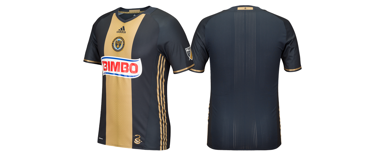
17) Philadelphia Union – Primary
I liked this kit when the team started six years ago but it’s the same kit every year. The team added snakeskin but no one can see it from more than a few feet away. The Union simply need to do more than the bare minimum in designing their primary kits.
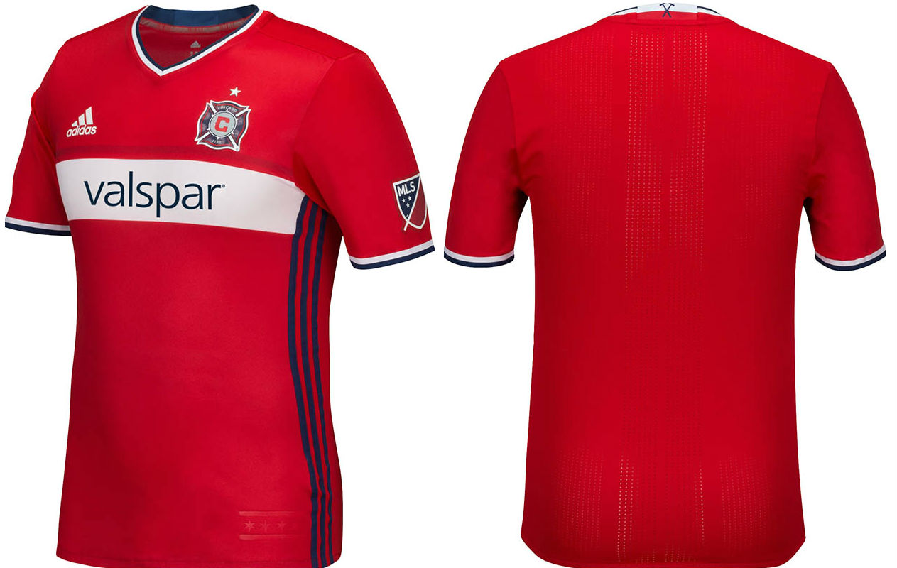
16) Chicago Fire – Primary
This looks like a default kit you would buy in bulk at Adidas for a youth soccer team. No risks taken, but very generic.
15) Real Salt Lake – Primary
Another kit that looks rather generic, but the color scheme looks way better than Chicago’s.
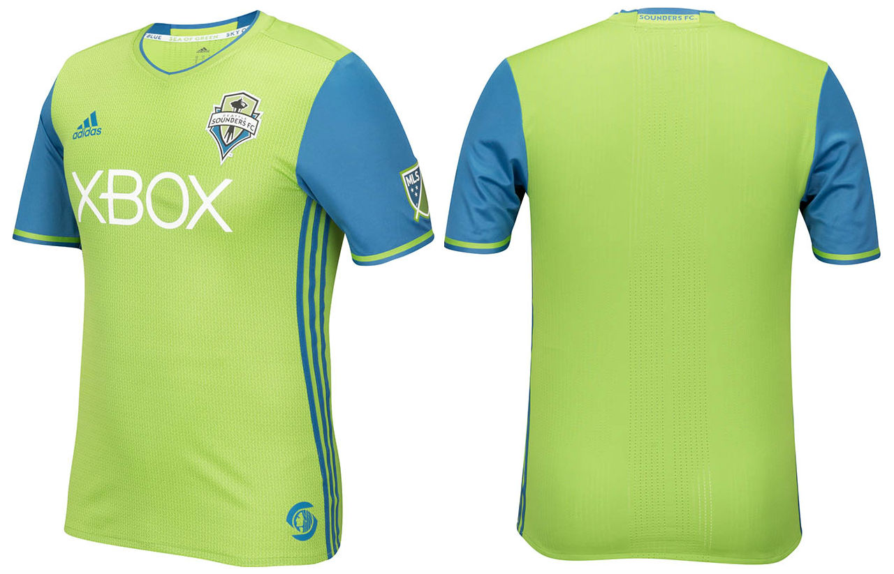
14) Seattle Sounders – Primary
I get that the Sounders’ trademark, as well as the city of Seattle, is that bright green. Some people like it, let’s just say it’s personally not for me.
13) Orlando City SC – Secondary
The purple sleeves on white make it look a bit weird but a solid effort nonetheless. I do like it when the shirt sponsor can be incorporated into the color scheme of the kit, which Orlando has done. The all-purple primary is way better.
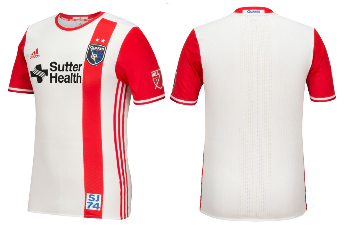
12) San Jose Earthquakes – Secondary
A mix of a throwback and modern that kind of works and kind of doesn’t. It’s not the best looking new kit out there but it’s not the worst either.
11) New York Red Bulls – Secondary
The Red Bulls put solid gold sleeves on blue, similar to Orlando but the gold and blue clashes a bit better. The “New York Red Bulls” on the lower back, like a fake “tramp stamp” is a bit strange but whatever.
CLICK BELOW FOR THE TOP 10

