

Every year, every team in MLS unveils one or two new kits. We at 32 Flags are here to rank each kit, both home and away and determine where each team ranks overall in their kit designs. Some of these kits, we agreed with how they looked while some others, we highly disagreed. Hopefully, with the three of us giving our input, our disagreements will even out and have a consensus ranking for each team.
We ranked each kit on a scale from 1-10 for a possible total of 60 points and we each determine our rank based on our own different factors. In case of a tie, the highest ranking that the three of us gave for a single kit was the tiebreaker. I (Phillip) ranked each kit based on look, design, innovation and if it was an improvement over the last kit. I also give more detailed explanations on each team below. Andy gives his explanations below for each team. Jeff ranked each kit solely on looks and design. For Jeff, a score of 5 mainly means that those kits were on the boring side.
Alright, let’s see which fanbase will be upset at us first. We start at #20.
20) Real Salt Lake
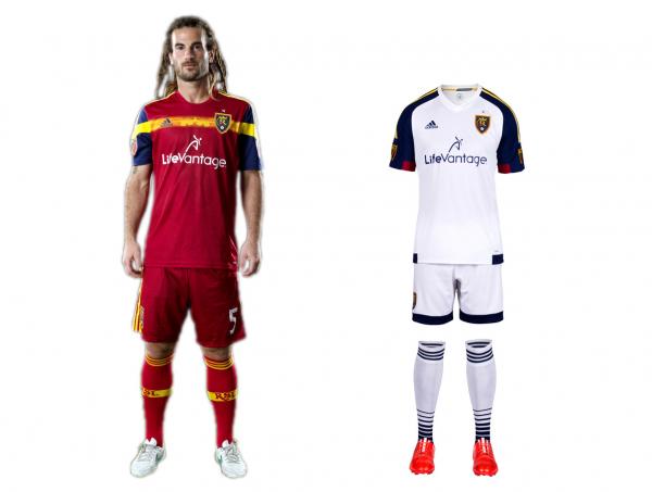
Image courtesy of si.com/planetfutbol
Ranking
Phillip – 6 (primary), 5 (secondary-new)
Andy – 3, 3
Jeff – 4, 5
TOTAL – 26/60
Explanation of kit
“While last year’s white away jersey had a single blue shoulder, the color is evenly spread across both sides of the shirt in the 2015 edition. The one carryover feature is the saying that appears on the inside neck tape: “The TEAM is the Star.” The back of the 2015 jersey also showcases a 3D version of a lion’s head, which is part of the team’s identity.” –mlssoccer.com
Additional comments
Phillip – “Both kits look a bit weird and not in a good way.”
19) Portland Timbers

Image courtesy of si.com/planetfutbol
Ranking
Phillip – 5 (primary-new), 6 (secondary)
Andy – 3, 5
Jeff – 4, 4
TOTAL – 27/60
Explanation of kit
“Down on the jock tag is a subtle reminder of the years of Timbers tradition with a “5/40” accompanied by the Timbers’ trademark axe. While the “40” is a reminder of the club’s 40 years of existence since 1975, the “5” represents the number of years the Timbers have been playing in MLS.” –mlssoccer.com
Additional comments
Phillip – “For somone who has loved Portland’s jerseys in the past, especially the third kits, I was left disappointed with the home. Pea green is not good.”
Andy – “What the hell is that home kit? Seriously brutal stuff for a jersey I loved and didn’t need to be re-worked to make it uglier.”
Jeff – “Not a fan of dark green kits usually and the away kit is just jarring.”
18) New York Red Bulls

Image courtesy of si.com/planetfutbol
Ranking
Phillip – 6 (primary-new), 7 (secondary)
Andy – 2, 2
Jeff – 4, 4
TOTAL – 27/60
Explanation of kit
“The colors of the kit – the red sleeves signify the love, fight, passion and glory of the club; while the black and red neck tape are a sign of the Red Bulls’ history in MLS. The kit also features a nod to the Metro Area with a unique ‘New York’ type that mimics the iconic New York Skyline. The new MLS crest will be branded on both sleeves representing the league’s three-part motto – For club, country and community.” –newyorkredbulls.com
Additional comments
Phillip – “Similar to LA, blue and gold works. The outrageously large Red Bull logo takes away from both kits but should be expected since Red Bull owns the team.”
Andy – “Nothing screams “Hey, look at us, we’re trying hard to be cool” than the look Red Bull New York is putting out this season. What the hell is that script on the kits for anyway?”
17) New York City FC
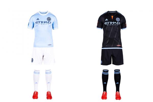
Image courtesy of si.com/planetfutbol
Ranking
Phillip – 8 (primary-new), 7 (secondary-new)
Andy – 3, 4
Jeff – 3, 4
TOTAL – 29/60
Explanation of kit
“The primary jersey, decked in “City Blue,” features the NYCFC word mark on the inside neck tape. The back neck will have NYCFC print, and there is also an “Inaugural Season” tag on the lower left corner of the jersey.” –mlssoccer.com
“Among the features are five stripes across the front of the jersey to represent the five boroughs of New York City, as well as an “Inaugural Season” patch on the bottom of the jersey, and the NYC logo in the team crest on the back neck of the shirt.” –mlssoccer.com
Additional comments
Phillip – “Sky blue always looks great on a kit, NYCFC just loses a couple points due to lack of originality.”
Andy – “These kits are just a knockoff of what Manchester City looks like. I get corporate imaging and the links between the clubs, but a little differentiation would’ve been amazing.”
Jeff – “If I could give the NYCFC kits a negative score, I would. The fact that they are just Man City’s kits is insulting because it just shows the disregard that the owners hold for the club and its fans. It’s like they said, “well, we found these extra kits in the back room in Manchester, might as well use them.””
16) Philadelphia Union
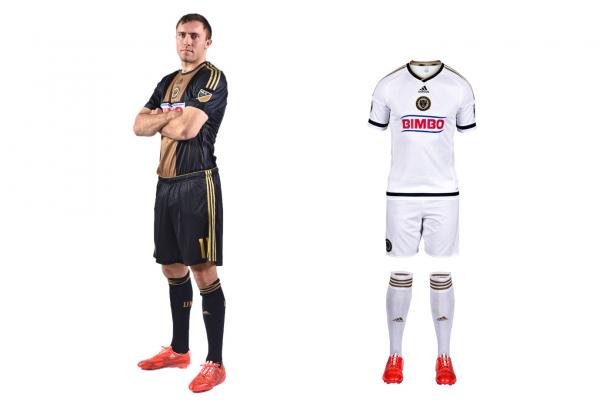
Image courtesy of si.com/planetfutbol
Ranking
Phillip – 6 (primary), 5 (secondary-new)
Andy – 3, 5
Jeff – 7, 5
TOTAL – 31/60
Explanation of kit
“The embossed stars make up the Union’s iconic center front stripe on the 2014 white kit. And there are more stars found on the inside neck tape alongside the “We Are One” club slogan.” –mlssoccer.com
Additional comments
Phillip – “The primary looks good but it’s pretty much been the same kit since the beginning. I guess they’re going to stick with it an make it a historic kit. The away is just white and the crest looks weird in the middle of the chest. Sponsor logo sticks out and doesn’t fit with either kit. If they were to make the “Bimbo” logo into Union colors on the secondary, that would’ve made it a ton better.”
15) New England Revolution
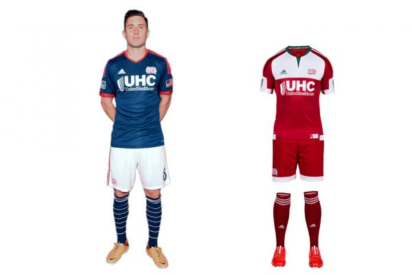
Image courtesy of si.com/planetfutbol
Ranking
Phillip – 7 (primary), 3 (secondary-new)
Andy – 4, 4
Jeff – 6, 7
TOTAL – 31/60
Explanation of kit
“The away shirt is inspired by the Flag of New England — red, white (on the chest) and green (neck and collar). The flag can be found on the back neck in all its glory, but it comes with a twist: The Revs logo is faded into the solid red part of the flag. For a full description of what it represents, look no further than the jock tag on the lower left corner of the jersey, which reads, “Dating back to 1775, this flag represented the New England colonies in the Revolutionary War. This jersey celebrates the bond between the club and its supporters, who fly the flag today.”” –mlssoccer.com
Additional comments
Phillip – “I get that the away kit represents the NE flag but that red and green…yikes. The home is a vast improvement even though they’re due for a different crest.”
Andy – “It’s great that the Revs have a local company sponsoring them, but damn if that logo isn’t massive and an eyesore on what has to be an upgrade for the overall look. Take that logo off and these might be my favorite kits in the league.”
14) FC Dallas

Image courtesy of si.com/planetfutbol
Ranking
Phillip – 6 (primary), 5 (secondary-new)
Andy – 6, 4
Jeff – 6, 4
TOTAL – 31/60
Explanation of kit
“Among the other details on the new jersey are: (1) the LH on the back neck in honor of late owner Lamar Hunt; (2) the popular “Dallas ‘Til I Die” slogan on the neck tape in red and blue; and (3) a new V-shaped front collar.” –mlssoccer.com
Additional comments
Phillip – “The stripes on the lower part of the back of the jersey looks weird. It looks like something QPR would wear. The shirt sponsor sticks out like a sore thumb and there’s no stripe there.”
Andy – “I LOVE, LOVE, LOVE the all-red kit, that’s the best one FC Dallas has put out since the image and name change if you ask me.”
Jeff – “The Dallas away I hated because the stripes stopping halfway is a bad look.”
13) Montreal Impact
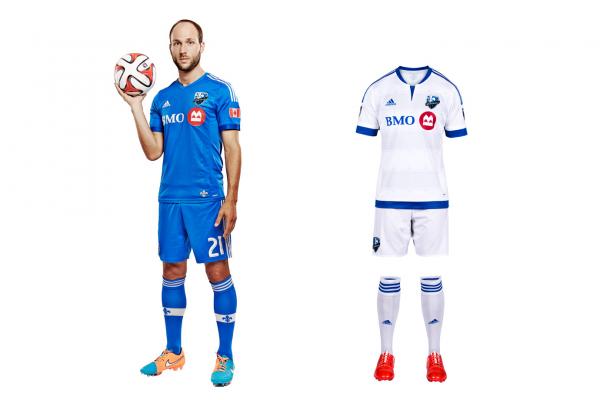
Image courtesy of si.com/planetfutbol
Ranking
Phillip – 5 (primary), 5 (secondary-new)
Andy – 5, 6
Jeff – 5, 6
TOTAL – 32/60
Explanation of kit
“The new shirt is an updated look to their white away shirt from last year with a new front neck design and a shade of three horizontal stripes across the front. The other major feature is the Montreal fleur-de-lys, which is (1) engineered into the fabric (see right), (2) subtly added to the background of the club crest and (3) showcased in metallic 3D form on the back of the shirt near the neck line.” –mlssoccer.com
Additional comments
Phillip – “Montreal’s secondary looks great up close. Far away it looks plain but the fleur-de-lys gives it a nice touch.”
12) Toronto FC
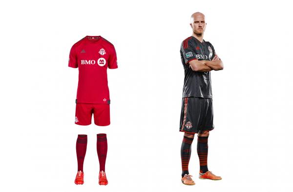
Image courtesy of si.com/planetfutbol
Ranking
Phillip – 4 (primary-new), 7 (secondary)
Andy – 5, 6
Jeff – 5, 6
TOTAL – 34/60
Explanation of kit
“Highlights include a Canadian maple leaf (pictured right) and the club slogan “All For One,” both featured in 3D embossed metallic red.” –mlssoccer.com
Additional comments
Phillip – “Primary kit is rather plain. The secondary gives subtle detail that makes it work.”
11) Chicago Fire
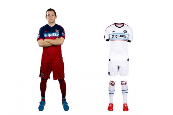
Image courtesy of si.com/planetfutbol
Ranking
Phillip – 5 (primary), 7 (secondary-new)
Andy – 5, 7
Jeff – 5, 5
TOTAL – 34/60
Explanation of kit
“The new Fire shirt keeps with the hometown theme, featuring a light blue bar across the chest borrowed from the City of Chicago flag. The full version of that flag is located on the back neck of the jersey with the words “Chicago Fire Soccer Club” printed inside the blue bars. Among the other features of the kit is the new-look MLS logo on the left sleeve as well as the inside neck tape which features the club’s long-time slogan: “Tradition, Honor, Passion.”” –mlssoccer.com
Additional comments
Phillip – “The mix between red and blue has a rather bad looking clash. The secondary kit, while plain white, has a great blend of light blue and white.”
Andy – “Incorporating more of the city flag colors is a good idea, but I love it a lot more on the away kit than I do the home. Overall a better look than last season that’s for sure.”
CLICK HERE TO SEE THE TOP 10